mirror of
https://github.com/MonitorControl/MonitorControl.git
synced 2026-06-30 06:02:00 -06:00
[GH-ISSUE #655] Clipped border in the preferences in some localizations #455
Labels
No labels
Status: Abandoned
arm64
beta
beta
bug
done
duplicate
enhancement
feedback needed from reporter
in progress
invalid
investigating
known Issue
monitor Issue
pull-request
translation
unable to reproduce
unreleased
x86
No milestone
No project
No assignees
1 participant
Notifications
Due date
No due date set.
Dependencies
No dependencies set.
Reference: github-starred/MonitorControl#455
Loading…
Add table
Add a link
Reference in a new issue
No description provided.
Delete branch "%!s()"
Deleting a branch is permanent. Although the deleted branch may continue to exist for a short time before it actually gets removed, it CANNOT be undone in most cases. Continue?
Originally created by @stiiveo on GitHub (Oct 2, 2021).
Original GitHub issue: https://github.com/MonitorControl/MonitorControl/issues/655
Originally assigned to: @waydabber on GitHub.
Before opening the issue, have you...?
Describe the bug
I combine these two issues into one ticket cause I think they're both minor issues.
The placeholders of the buttons for recording keyboard shortcut are not localized.
Steps to reproduce
They are both visible right in the Keyboard and Displays section of the preferences panel.
Expected behavior
Anything else?
No response
Environment Information (please complete the following information)
@waydabber commented on GitHub (Oct 2, 2021):
Hi @stiiveo
I can't seem to be able to reproduce the clipping issue. I thought it might be becaused of the enabled mouse scrollbar but still it doesn't seem to do that with me. Is it happening only with Chinese language? Thank you!
@stiiveo commented on GitHub (Oct 2, 2021):
That seems to be the case. If I switch the language back to English the issue disappears.
@waydabber commented on GitHub (Oct 2, 2021):
Regarding the keyboard shortcuts box, localizations should be added here:
https://github.com/sindresorhus/KeyboardShortcuts/tree/main/Sources/KeyboardShortcuts/Localization
For more information see this: https://github.com/sindresorhus/KeyboardShortcuts#localization
This is a separate project, but once the localization is accepted by that repository, it will be incorporated into MonitorControl as well.
@waydabber commented on GitHub (Oct 2, 2021):
Great. This way I can reproduce it and try to fix it. Thank you!
@waydabber commented on GitHub (Oct 2, 2021):
I added the info regarding the shortcuts localization to the tutorial https://github.com/MonitorControl/MonitorControl/discussions/637 and used your screenshot with your implied permission. :)
@stiiveo commented on GitHub (Oct 2, 2021):
Great! I'll dive into that one if I could find some time.
@waydabber commented on GitHub (Oct 2, 2021):
I moved around the layout a bit + fixed other clipped text on that view which sometimes occured. Now it seems ok to me:
But please test (it is in the
fixes/generalbranch)@stiiveo commented on GitHub (Oct 3, 2021):
Thanks for the quick fix!
I've tested the Chinese (Traditional, Taiwan) localization and no clipping issue is visible. 👍
To ensure that no clipping issue occurs in other translations, I tested other supported languages and could still spot the clipping issues.
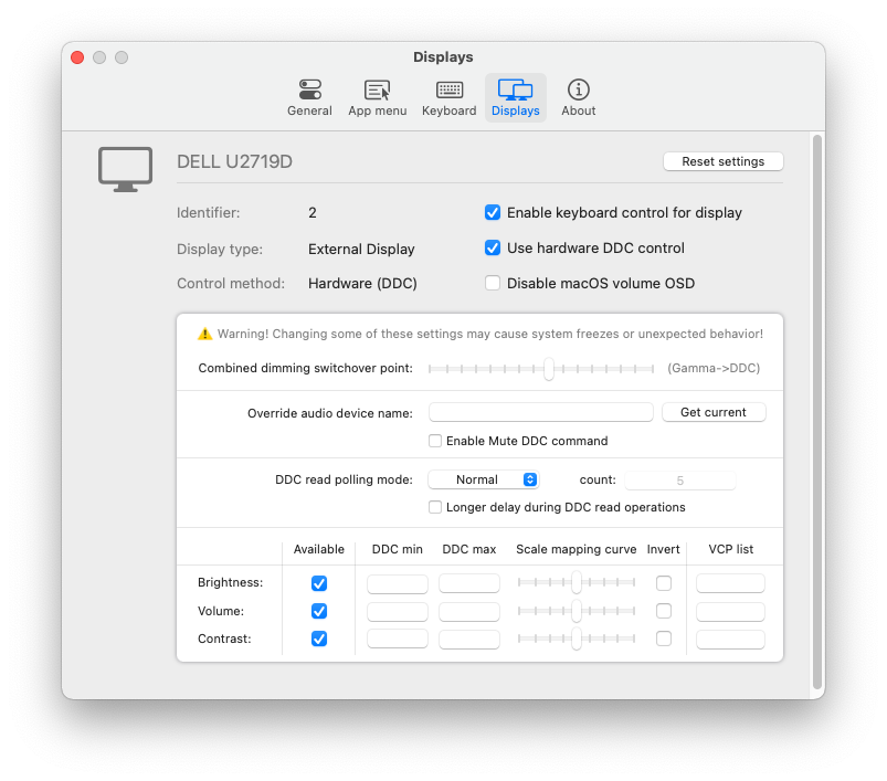
(The following screenshots are taken with Dutch localization)
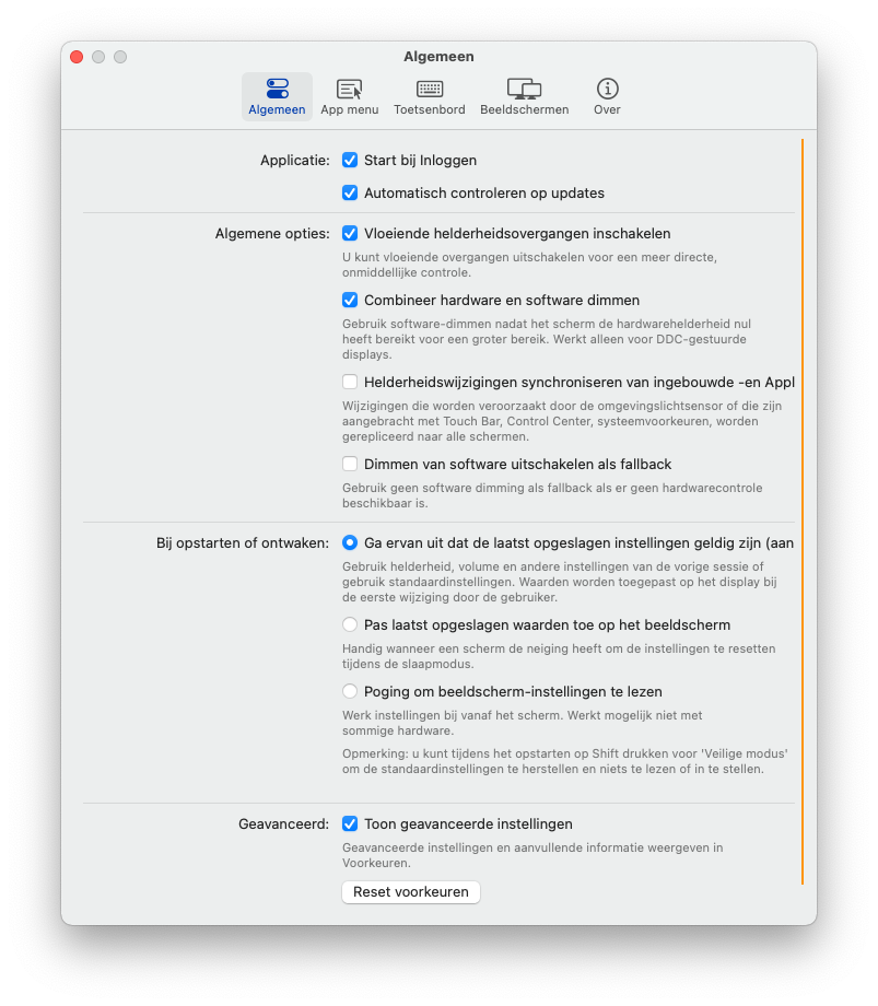
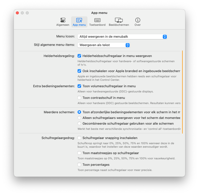
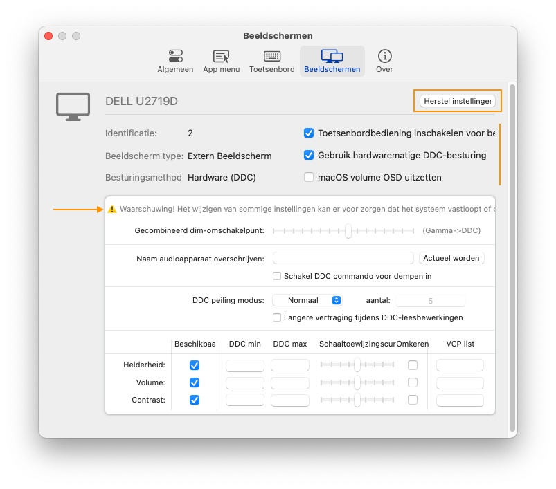
The issue can be seen in General, App menu, Keyboard and Displays sections in the following languages:
Dutch, French, German, Italian
The issue can only be seen in Displays section in the following languages but they're mostly only partially translated:
Polish, Russian, Spanish(Latin America), Turkish
I hope the info above could make it easier for you to debug it. :)
@stiiveo commented on GitHub (Oct 3, 2021):
I'm not sure if it's appropriate to make a suggestion here but since it's related to this issue, I'd just put it here.
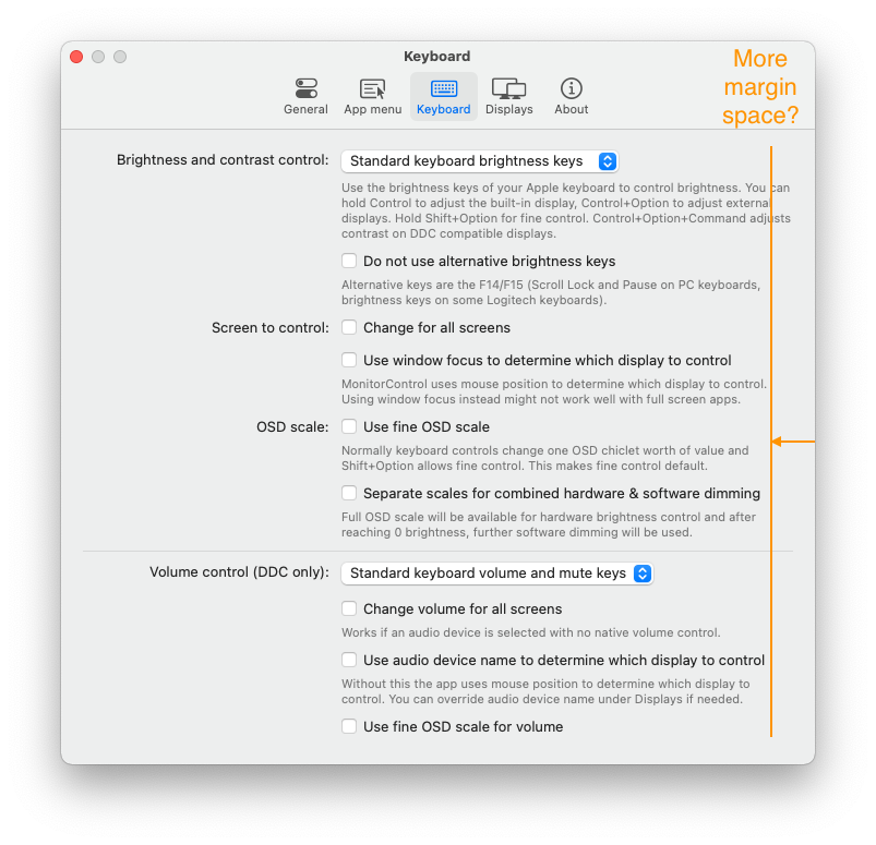
I think a bit more margin on the right hand side of the panel should make it easier for the users to read the text content. To me the line is a bit too long. But I'm also aware that if the line breaks too soon and the text count is big, it could make the panel stretches too long. So a right balance has to be found here.
@waydabber commented on GitHub (Oct 3, 2021):
@stiiveo wow some languages are indeed verbose. :)
The problem is, checkbox lables don't support wraps layout as simple labels do so they can't wrap to two lines if needed expanding the layout. This could be done programmatically for each item but it would be a pain to implement. :)
I guess I could add a little more space but I did want to preserve the feeling of a Preferences window and making it too wide somehow deducts from that.
@JoniVR - Is it possible to just make the Dutch translation in some of these options just a tiny bit more succinct? If the language permits of course. I know it's hard since Hungarian is a verbose language as well (compared to English) and I had to be creative here and there as well when working on the translation. :)
@waydabber commented on GitHub (Oct 3, 2021):
I did make the width wider (with about 40 pixels and rearranged everything so labels would have more space in them. I also shifted the divide on the first three panes a bit left for even more space on the right column.
@waydabber commented on GitHub (Oct 3, 2021):
Still there are some Dutch text that are clipping but the situation is better. :) I'll leave it to @JoniVR whether these texts can be shortened a bit.
@waydabber commented on GitHub (Oct 3, 2021):
Again, thanks @stiiveo for your input and care!
@JoniVR commented on GitHub (Oct 3, 2021):
I mean technically I could, but that doesn't seem like a very good solution to me?
Ideally, it would wrap as necessary, we can't really ask every translator to shorten their translations due to length differences.
@stiiveo commented on GitHub (Oct 3, 2021):
If you want to limit the max height of the panel, maybe consider making the panel scrollable if the intrinsic size pass the threshold?
@waydabber commented on GitHub (Oct 3, 2021):
Yes, wrapping would be the optimal solution. The normal text labels do wrap but unfortunately the checkbox labels do not wrap (or they do wrap if we force them but don't change their frame height even then). I can try programmatically iterate through all checkbox labels and set their height manually once the initial rendering is completed though. This will work on the first three panes but not on the Displays tab as that does not use gridview (gridview will adapt to the contents if needed and the view constraints are tied to the GridView height - this was needed to be able to dynamically show/hide advanced preferences).
@waydabber commented on GitHub (Oct 3, 2021):
@stiiveo the problem is how the checkbox label itself works by default, not the panel (which is dynamic as of now and adapt automatically). There is a programatic way to handle this if this is really what we want (I can disable autoresizing on all checkboxes, render them, figure out the number of lines that resuls after translation and dynamically multiply the default height by the number of lines).
@JoniVR commented on GitHub (Oct 3, 2021):
What could technically also work to wrap checkboxes is using a checkbox (with no text), adding a label next to it in a StackView and adding a click gesture recognizer to the StackView as a custom component.. though that might be a bit overkill? Not sure.
Again, I can probably shorten the translation, but to me it seems like other languages will/are facing the same issue. Perhaps the items in general can be shortened a bit somehow? We wouldn't have to throw away translations if we just shorten the base since it would still mean the same thing.
Just trying to find a solution that's going to be easiest to work with in the future.
@stiiveo commented on GitHub (Oct 3, 2021):
I can see your point. But there's also another thing needed to be considered. If new box or label were added in one of the tabs in the future or somehow the string count is enormously large, it would make the panel infinitely long until the content is fully enclosed.
@waydabber commented on GitHub (Oct 3, 2021):
@stiiveo I think we can't add any more stuff to these panes (in advanced mode). I was on the verge of moving all combined control/syncing related stuff to a separate "Sync" pane but eventually decided against it. In one of the next versions I think we'll move to an entirely different layout (sidebar on the left for category + scrollable view with options on the right) which will be super flexible.
@JoniVR - well I feel that is a bit overkill + again, it won't work in the Displays tab anyway (unless we doo a complete redesign - which might be needed anyway as the current layout is not entirely logical, the advanced part is mostly relevant for DDC displays for example but still is present in disabled form for all other displays).
I think the simpler solution would be to just shorten the text for now and when we do the full Prefpanes redesign, we'll aim for a fully dynamic approach - I would not pour more energy into fixing this one as ultimately the current layout is a dead-end I think.
@JoniVR commented on GitHub (Oct 3, 2021):
Agreed we can't keep making panels longer and adding tabs infinitely, Xcode preferences does seem to do some minor scrolling here and there, so that might indeed be a solution, though I do hope we're about "feature-complete" at this point besides from a few more settings that are heavily requested. Can't keep adding settings infinitely either.
@JoniVR commented on GitHub (Oct 3, 2021):
Seems good to me, will see if I can shorten it a bit.
When do you propose a redesign? Because that would probably be another major change then, are we planning v5.0.0 already? 😂
@stiiveo commented on GitHub (Oct 3, 2021):
If so you guys need to put some text count limit in the readme as well 😂
@waydabber commented on GitHub (Oct 3, 2021):
Well, I'd leave the redesign for a future major release, yes, definitely not during this beta cycle. :)
I'd also like to refactor how displays control works in general (the current AppleDisplay/OtherDisplay approach is still not logical, even though I tried to make things more unified in this release) and make it more flexible - we should have a simple Device with pluggable control options. For example some displays can be controlled vida CoreDisplay, DDC, Gamma and shading as well, each has its own drawbacks and benefits - like shading does not break f.lux while gamma does, etc. It would be great if the user could choose the control method. Also volume control might have multiple methods in the future and contrast control can be done using Gamma and DDC. There are devices that support only brightness or only volume (like other digital devices, like AV receivers). The architecture should be extensible and we should devise an interface that is straightforward for general users but customizable for Expert users (btw we could rebrand 'Advances settings' to 'Expert or PRO options' which might have a better ring to it).
There are a lot of feature things we could implement to make things even better. But I understand that we want to avoid making MonitorControl overly bloated (some might feel that even implementing all these feature requests was a bit too much). :)
@waydabber commented on GitHub (Oct 3, 2021):
But before everybody starts to worry that I'll start rewriting everything again like crazy, I am actually trying to restrain myself as I feel MC took too much of my focus lately which is not entirely balanced considering all the other things I should be doing. :)
@stiiveo commented on GitHub (Oct 3, 2021):
@waydabber There's always new feature to be added. Prioritize your things first. Yes it's good to have the features you mentioned but I believe the app as of now meets majority's needs. Not every user is expert right? ;)
@waydabber commented on GitHub (Oct 3, 2021):
Hey @stiiveo thanks for the advice. Btw, I don't feel this as a burden at all (the problem is I seem to enjoy coding too much). :)
@JoniVR commented on GitHub (Oct 3, 2021):
Perhaps this is something where we could ask some help from UX specialists in the community (for layout changes in the future that is).